After sketching ideas surrounding the birthday idea in an attempt to find a direction to move in and struggling to feel like I was getting anywhere I decided to try something new. I started looking at events from around the past 100 years which have been positive and significant, I thought about using these events and incorporating the GF Smith paper anniversary into them, making the 100 year anniversary seem as extraordinary as the historic events.
The main ones I felt I could work with were:
First landing on the moon!
women getting the vote
television invented
first phone
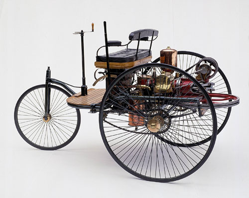
first ever car!
the first camera
Friday, 11 March 2011
Looking at typeface
I experimented with different styles of typeface in my sketchbook which were randomly chosen. I then started to look at the style of typeface G F Smith had used on their website:
Helvetica style font, simple and plain but works well against the colourful busy background. Depending on how I want to project my final idea this typeface could work well or seem slightly boring, would be nice to follow the same original typeface though.
The logo's are a little more playful showing another path I could go down
Thursday, 10 March 2011
100 years.
Next I began looking at significant events from the last 100 years and seeing if I could play about with this idea, again mainly shown through my sketchbook. The idea I had was to take one of these events and associate the GF Smith paper anniversary to be as important.
Ideas
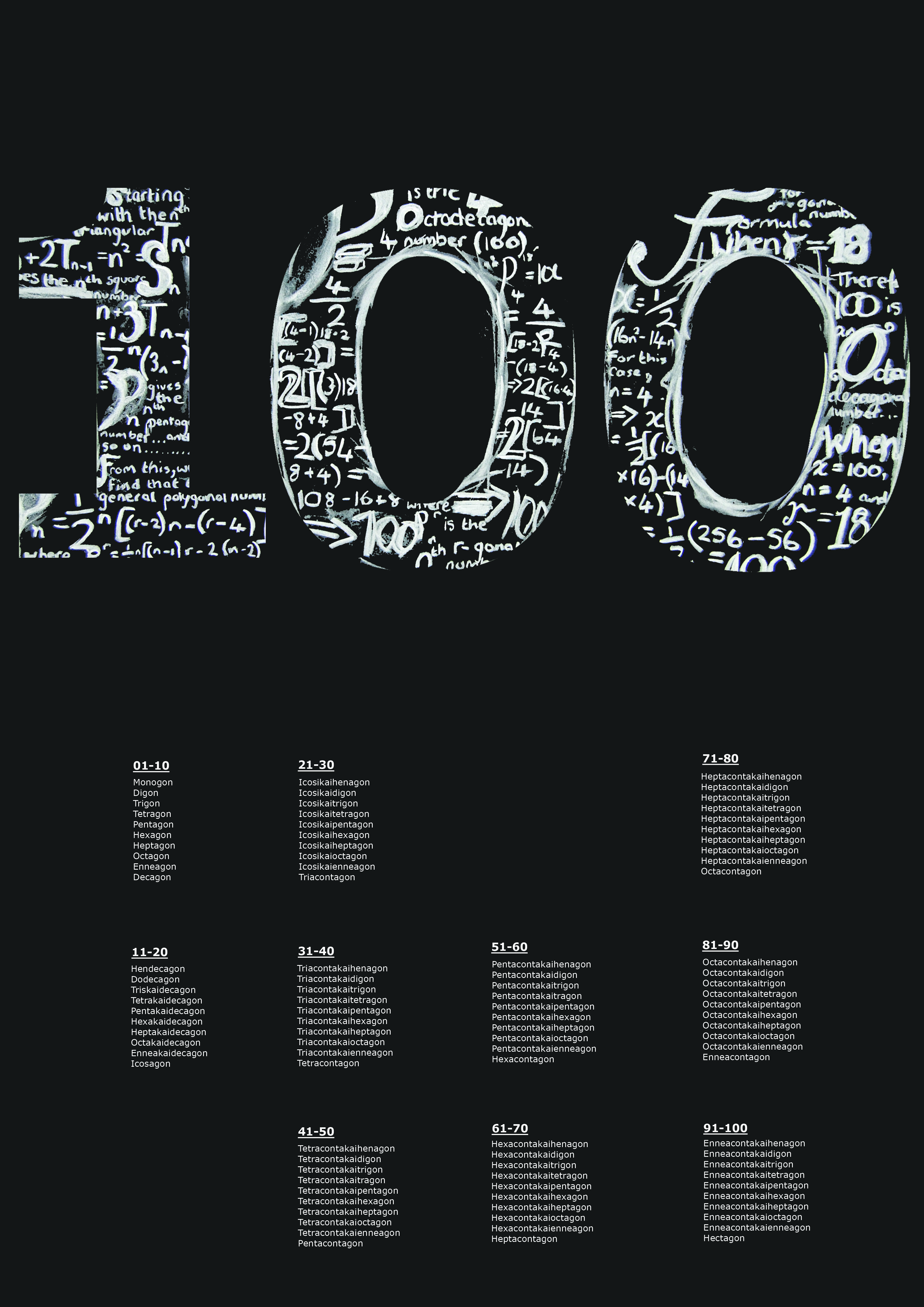
After not finding much to work on from the website and other research I started to experiment with ways in which I could express and emphasise the 100 years. I started with typography and sketching various ways in which I could manipulate the number 100. I also looked into ways in which other people had expressed the number.
predictable
plain and simple
colourful
working a bit more into the birthday theme...
illustrative
100 typefaces
simple but I think really effective
colourful 3D
GF Smith Paper
I started by looking at the style of their website, I found it quite simple with splashes of colour here and there and helvetica type font seemed to be used through out.
Various inspirational ideas
Various pieces I cam across when researching that caught my eye. I do like the colour used in some pieces but much prefer the black and white theme
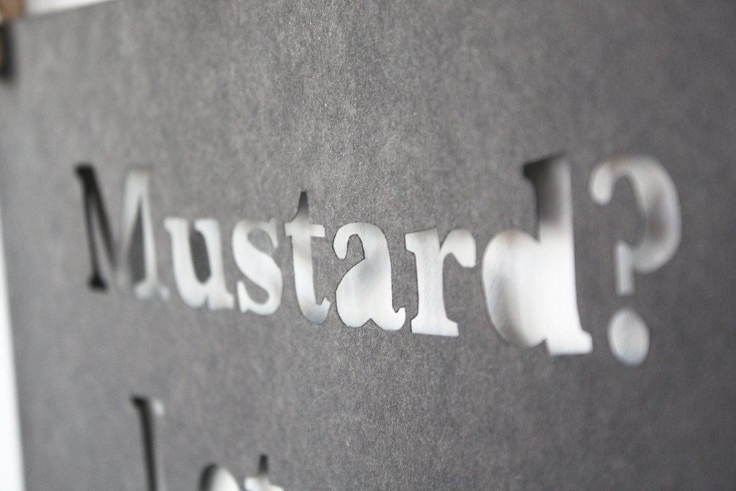
Simply cutting into the paper I think is a great technique low saturation again I like the idea of sticking to the black and whites
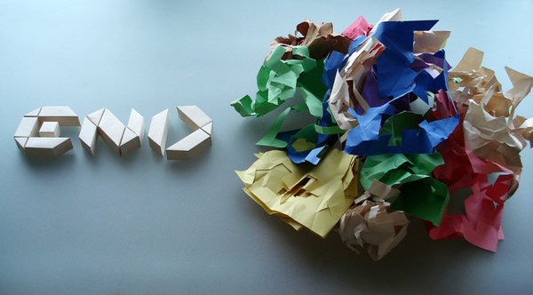
Scrunching and manipulating paper to create the typeface
3d paper manipulation I like this idea could possibly look further into how many typefaces this would work effectively for
perspective text, I like the 3D outcome
I really liked how the text is create so perfectly surrounded by a messy finish
more 3D type
I like how each character is joined together creating a pattern and a message
Friday, 4 March 2011
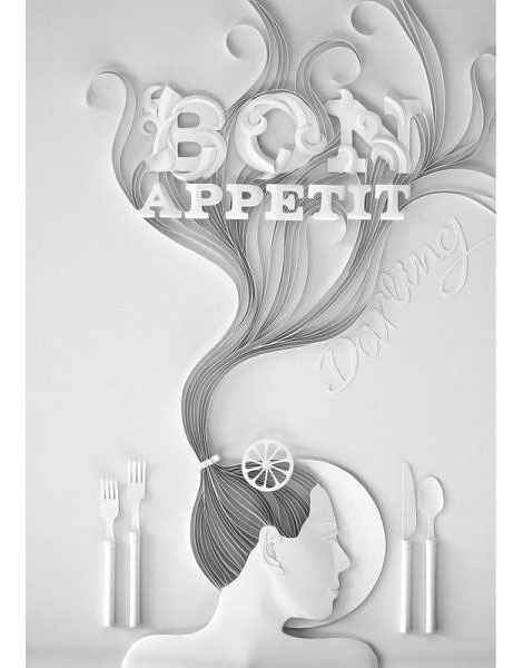
Yulia Brodskaya
Yulia Brodskaya is probably the most inspiring artist i've come across, her typographical and illustrative paper art is fascinating.
The decorative style of typography really makes an impact, the delicate illustrations pair really well with the organic feel of the design.
Subscribe to:
Posts (Atom)