Various pieces I cam across when researching that caught my eye. I do like the colour used in some pieces but much prefer the black and white theme
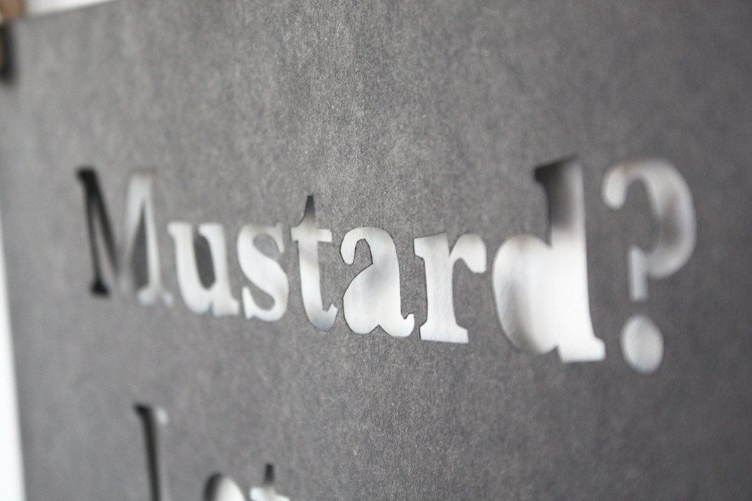
Simply cutting into the paper I think is a great technique low saturation again I like the idea of sticking to the black and whites

Scrunching and manipulating paper to create the typeface

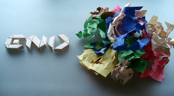
3d paper manipulation I like this idea could possibly look further into how many typefaces this would work effectively for

perspective text, I like the 3D outcome

I really liked how the text is create so perfectly surrounded by a messy finish

more 3D type
I like how each character is joined together creating a pattern and a message
No comments:
Post a Comment